Everything you need to
write about PlayerFocus.
Logos, colors, typography, and usage guidelines. For questions or custom assets, reach out to press@playerfocus.ca.
Logos
Pick the right lockup for your surface.
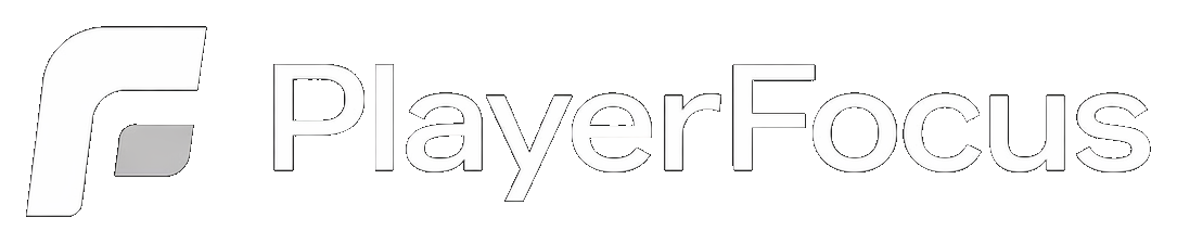
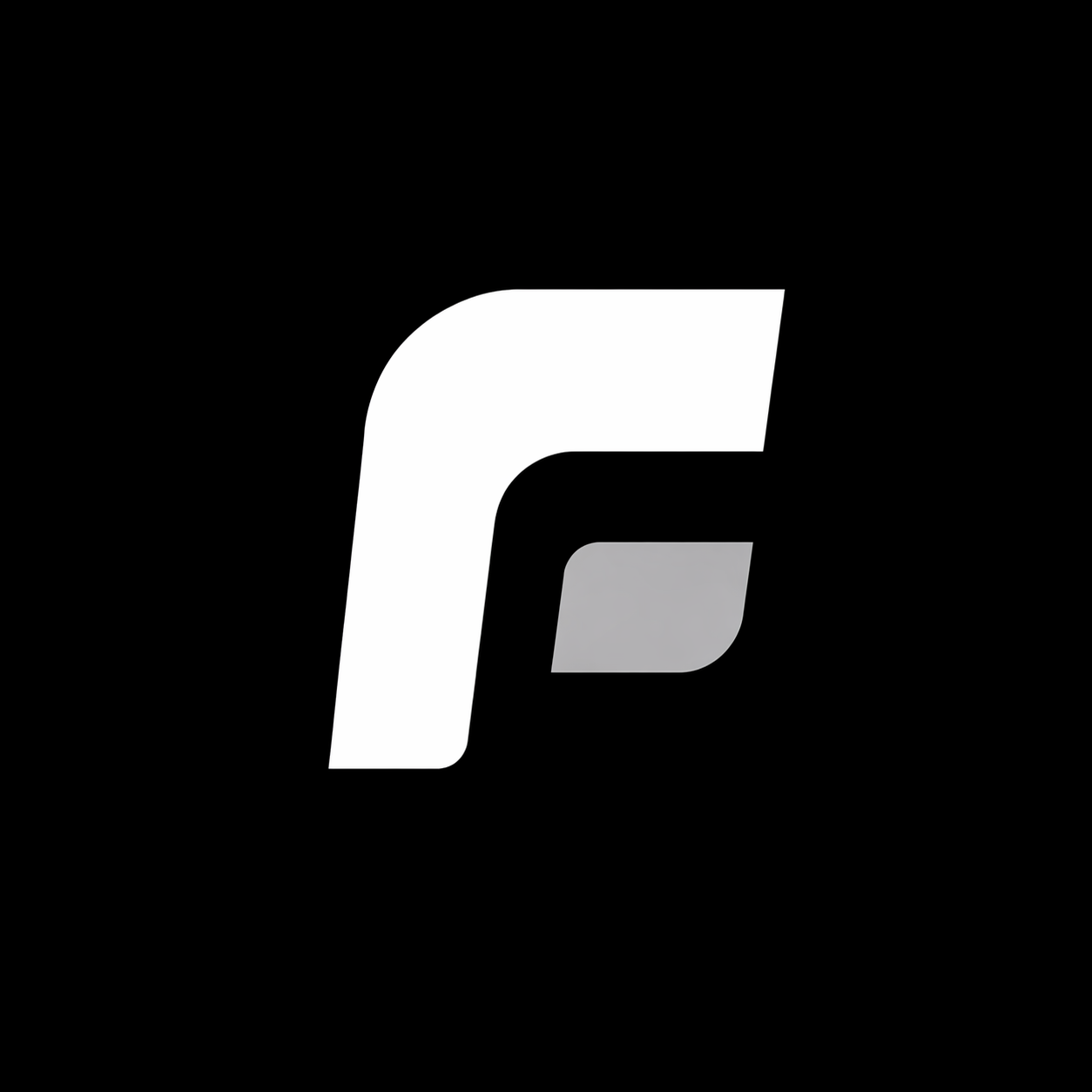
Primary — horizontal
Mark + wordmark. Use this on almost everything.
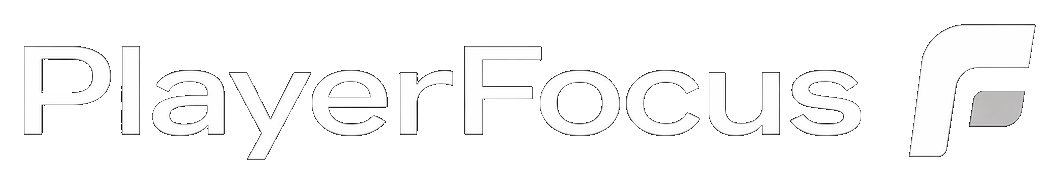
Reverse horizontal
Wordmark first, mark right-aligned. Useful for right-heavy layouts.
Mark only
For favicons, avatars, and tight spaces where the wordmark doesn’t fit.

Clear space & sizing
Give the logo room to breathe.
Clear space
Maintain clear space equal to the height of the mark’s rounded corner on every side. Don’t crowd it with text, icons, or other logos.
Minimum sizes
Mark · 24pxDon’t render the logo smaller than these sizes — the silver inner segment starts to disappear and the mark loses its balance.
Colors
A tight, intentional palette.
Brand Black
#08080A
Brand White
#FFFFFF
Brand Silver
#C7C7C7
Accent Emerald
#10B981
The logo is always rendered in Brand White with the Brand Silver inner segment on the mark. Brand Black is the default background. Accent Emerald is reserved for status indicators and call-to-action accents — never used on the logo itself.
Typography
Inter everywhere.
Inter · Google Fonts
Display · 600, tight letter-spacing
Parents see progress.
Body · 400 / 500
PlayerFocus sits on top of your existing club tools — turning coach session notes into structured development reports that families actually read.
Eyebrow · 10.5px, 600, uppercase, tracking 0.14em
Player development
Usage
Do and don’t.
- Use the primary horizontal lockup whenever it fits.
- Render the logo in Brand White on Brand Black or other dark surfaces.
- Keep clear space around the logo at all times.
- Use the mark-only version when space is tight (favicons, avatars).
- Pair with Inter for any supporting typography.
- Recolor the mark or the wordmark outside of the official palette.
- Stretch, rotate, or skew the logo.
- Add shadows, gradients, outlines, or effects.
- Place the logo on a busy photo without sufficient contrast.
- Separate or rearrange the mark and the wordmark.
About PlayerFocus
Copy / paste boilerplate.
Company boilerplate
PlayerFocus is a player-development platform built for youth-sports clubs and academies across Canada. It sits on top of existing club tools — like TeamSnap — and turns coach session notes into structured development reports that families actually read. PlayerFocus is built, operated, and available in Canada only, across 27+ sports, with pricing in Canadian dollars.
Naming
- Company
- PlayerFocus
- Capital
- Always “PlayerFocus” — one word, camel case. Never “Playerfocus” or “Player Focus.”
- Domain
- playerfocus.ca
- Press
- press@playerfocus.ca